West End Precinct.
Brand Touchpoints:
Branding. Design. Digital Marketing. Illustration. Marketing Strategy. Photography. Social Media. Video. Website.Revitalising the Heart of the City.
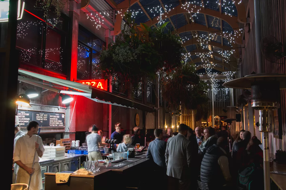
West End Precinct shows how a vibrant community of boutique businesses can re-imagine a part of the city.
The urban renewal project at the heart of New Plymouth’s central city transformed the historic White Hart Hotel in a private partnership between West End Hospitality Group (previously Macfarlanes Hospitality Group) and property developers Jeremy Thompson and Harvey Dunlop. The goal was to develop heritage buildings into a mixed-use precinct of food and beverage businesses, boutiques, accommodation, offices and services.
As West End Precinct’s full service creative and marketing partner, Strategy Collective has spent the last seven years developing, launching and providing on-going communication for West End Precinct, including branding, signage, communications strategy, PR and media, web design, influencer activations, content production, traditional media buying and digital advertising.
You name it, we’ve been across it.


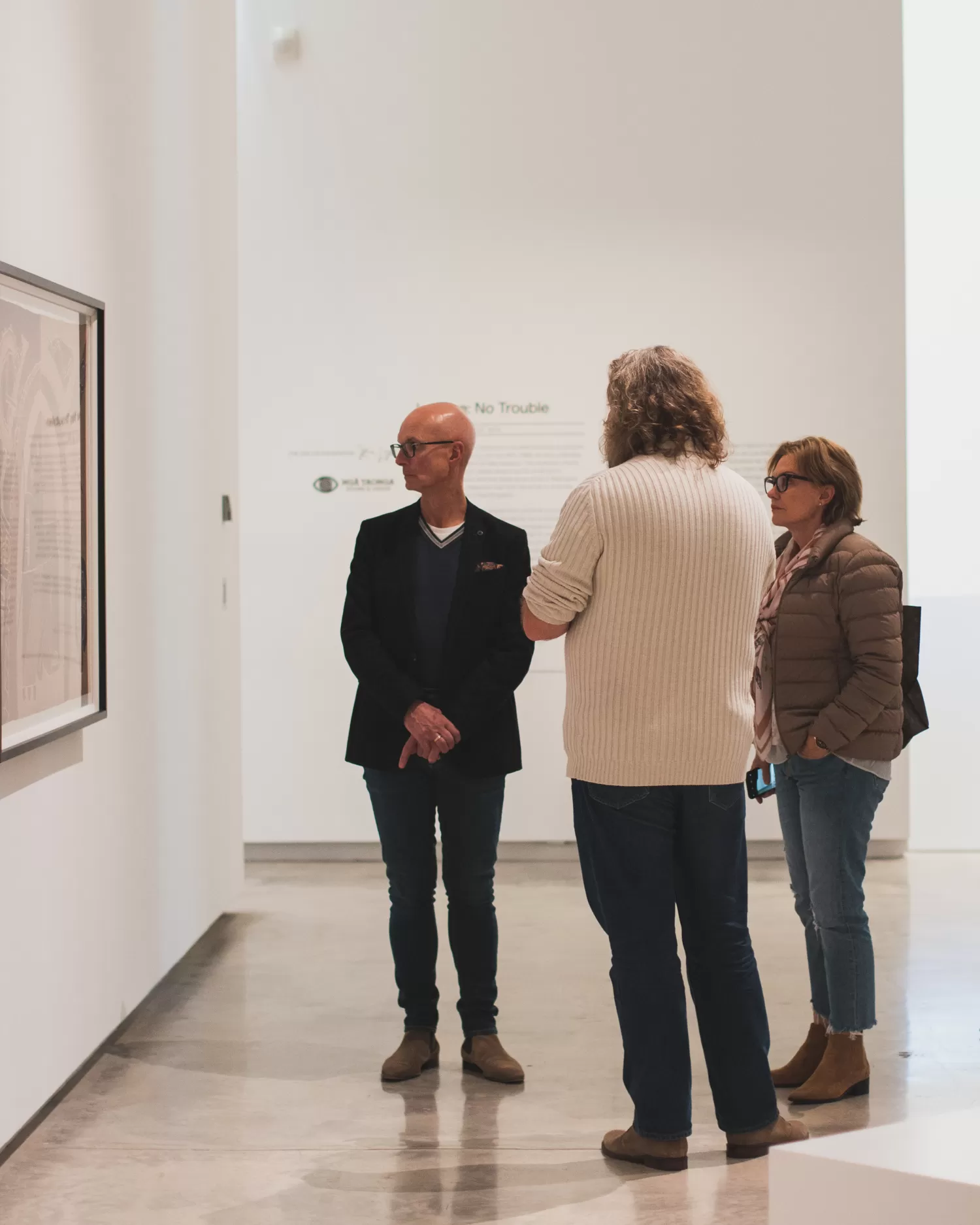
A Launch that Exceeded Expectations.
Our PR strategy garnered a significant number of earned media placements sparking a buzz that echoed throughout New Plymouth and beyond.
A particular highlight including having 10 journalists stay at the King and Queen hotel and giving them the opportunity to eat out at many of our establishments.
To make use of this exclusive audience we hosted them at a Ms Crabb fashion event within the Len Lye Centre.
The results were amazing, with many of the businesses within West End Precinct fortunate enough to have gained a wide range of media exposure.
Strategy.
We developed our multi-channel marketing strategy around a diverse range of customer personas: from families to office workers seeking lunch, after-work entertainers and out-of-towners wanting to discover the best hidden gems that New Plymouth has to offer.
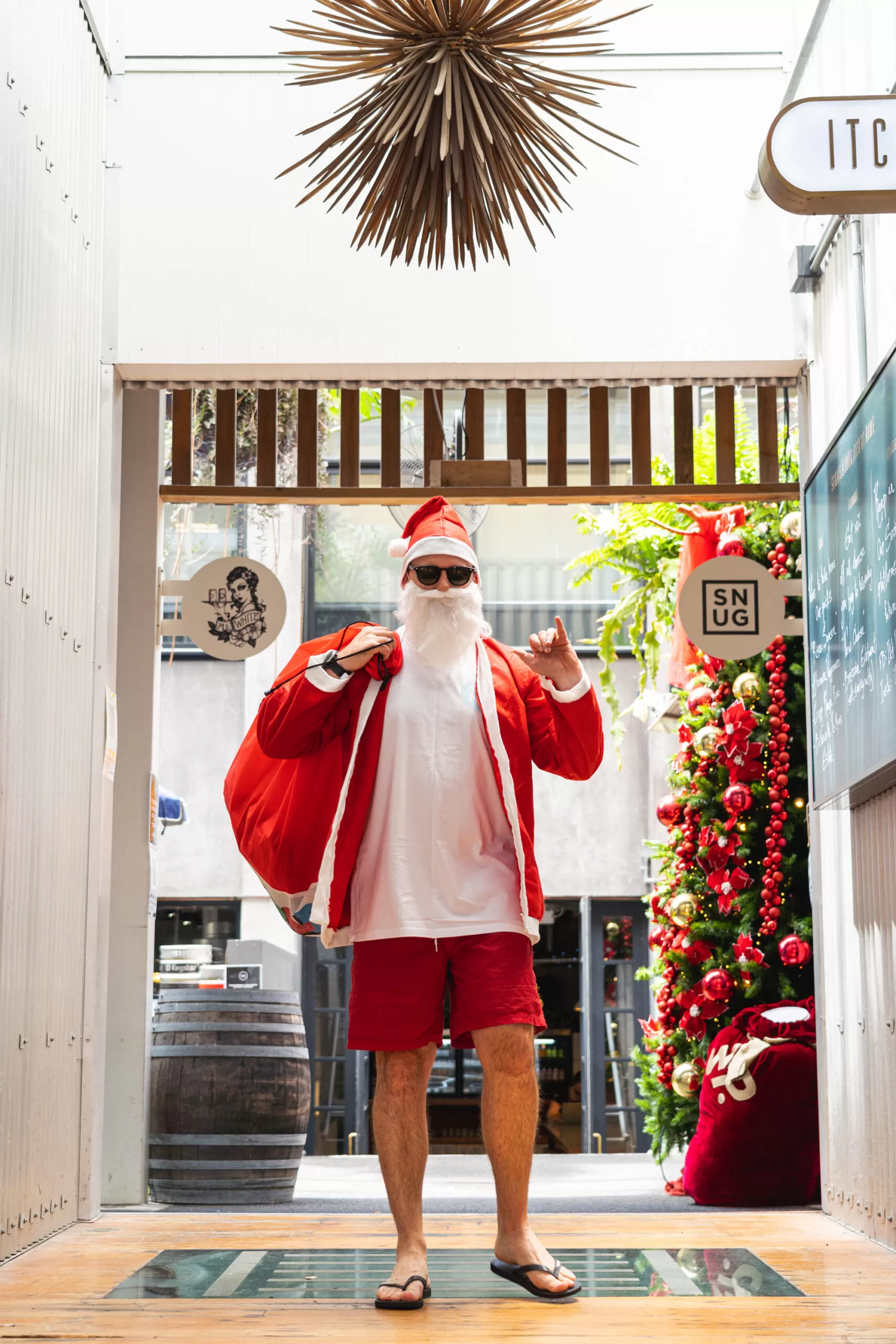
Leveraging Facebook and Instagram for targeted campaigns, generating local events like the Christmas markets, and sponsoring local festivals means we are able to reach a wide audience and have secured our sites as the best ones to visit in New Plymouth.